Event-Triggered Averages—a tutorial
Event-triggered averages, also known as Peristimulus Time Histograms (PETHs) are a method of analysis commonly used in neuroscience, but also in the finance industry and others. They were even used in recent posts by Facebook’s Data Science team:
They are used to determine the effect of triggered events (or spikes) on timeseries data. To create the event triggered average, we consider many events and average the responses to each. This smoothes out the irrelevant chatter to give a more pure, distilled representation of the response.
The original use, in neuroscience, was to measure the response (in a plot of brainwaves) to a stimulus. For example, the experimenter might measure a rat’s brainwaves over a twenty minute period. Every minute, the rat is fed a piece of cheese (the stimulus or event). Since the rat’s brain is responding to many things at any given moment, no single response is assumed to be reliable. But if we take the 15 seconds of response surrounding each stimulus and average all of those responses, we dampen much of the jitter. Only those relationships that show up in many observations are present in the average.
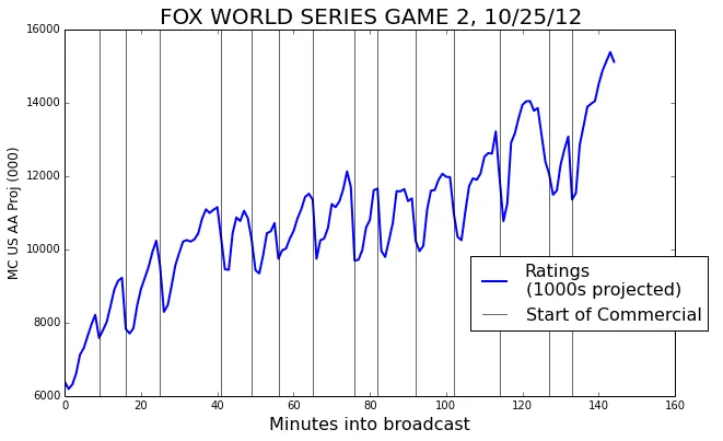
We will use Game 2 of the 2012 World Series as our example data. The ratings are our ‘response’. We will use the starts of commercial breaks as the events.
The events
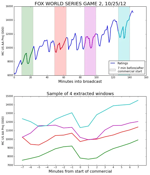
In order to do an event triggered average we need some events to be our triggers. To begin with, we’ll use the starts of each commercial break as our events. We’ll take a window around each event—7 minutes before and after. Plotted below is an example of such a window.
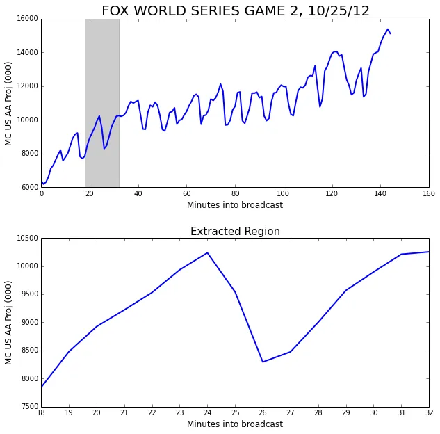
One window isn’t very interesting. We really ought to be considering a whole bunch; otherwise why bother averaging?
Let’s add a few more.
Now that we have a sense of where the observation windows are coming from, we can look at all the observations separately, and also in the average.
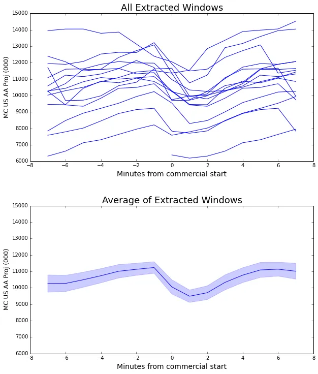
Since this curve is formed by an average of many windows, it represents the general case of what happens surrounding a commercial break.
We can make some observations from it. The steep drop between -1 and 0 minutes before start of commercials indicates that most viewers who will leave during a commercial leave right away. There is a smaller drop between 0 and 1 minutes after start of commercial, and then viewership begins to recover. By the 5 minute mark, the viewership is back to its previous level.
The pale blue band around the curve represents the standard error of the mean.
Significance
How can we be sure that this averaged curve has any significance, that it really has any relationship to the events that triggered it?
One way is the error band. We have a pretty narrow error band in the plot above. However, if the error band had been much larger than the scale of the changes in the average curve, the changes would not have been very important.
But we can do better. We want to know if this choice of event (commercial starts) had a significant effect on event average. So we can compare it to a control group of randomly positioned events. When we create one of these event triggered average curves using random values as the events we call it the ‘noise curve’. The event triggered average using the actual group of events is significant if it deviates from the noise curve enough to escape the error bands.
Because we might have only a small number of events, we will do a large number of trials, say 100, to ensure that our noise curve is stable.
We choose the same number of random events to construct the noise curve as we have actual events. The random events from a single trial are plotted below as black vertical lines.
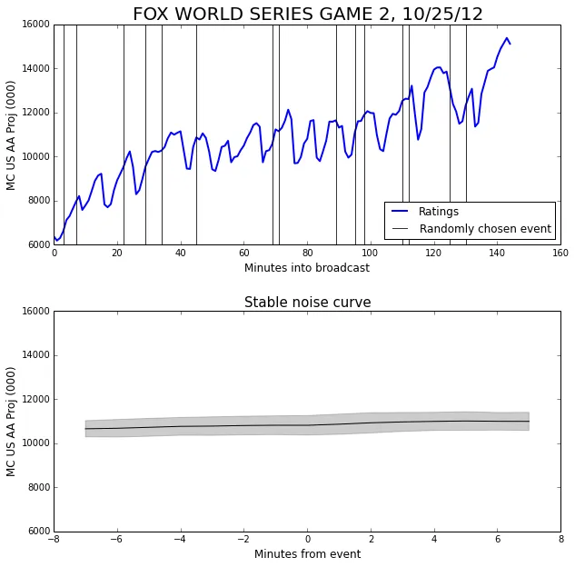
Each trial using random experiments produces a guess at the mean. The mean of these guesses gives us the stable noise curve. The standard deviation of the guesses gives the width of the error band above and below the noise curve.
It’s a little hard to tell at this scale, but the noise curve has a slight upward slope. This reflects the fact that the general trend is that the ratings are increasing. In fact, the slope (which is about 30) gives the average ratings increase per minute.
Now we can combine the noise curve with the curve for the commercial breaks to see the size of the effect.
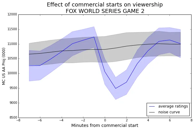
Now that we have the noise curve to give us some context, we can see that the viewership has a significant decline prompted by the start of the commercial. Since the distance from the noise curve to the blue curve is about 2.5 times the standard deviation of the noise band, this effect has greater than 99% confidence.
Computing a p-value
Treating the noise curve as our control and assuming equal variance, we can compute a p-value for a particular dip or bump via the following process:
- Take the difference between the noise curve and the average ratings curve.
- Divide by the standard error of the noise curve to give a z-score.
- Use your favorite method to turn the z-score into a p-value (table or equation). I tend to use a 1-tailed test.
Note: In step 1, it is also acceptable to use a change in the average ratings curve itself. For example, in the plot above, we might take the difference of the average ratings curve from minute -1 to minute 1. This can be a good idea when your noise curve is wholly above or below the event average curve.
Effect size
While the p-value is a measure of how sure we are that the events had an effect at all, we also care about the size of the effect. This can be read straight off the graph. For example, in the plot above, we could say that the start of a commercial break during Game 2 of the World Series induced a ratings drop of about 1500, on average. In some cases, it may be more meaningful to speak in terms of percent-changes rather than absolute values.
Multiple series
We can apply the event triggered average technique to more than one signal simultaneously. Let’s add another curve to the mix: the number of tweets posted about the World Series each minute as collected by SocialGuide.
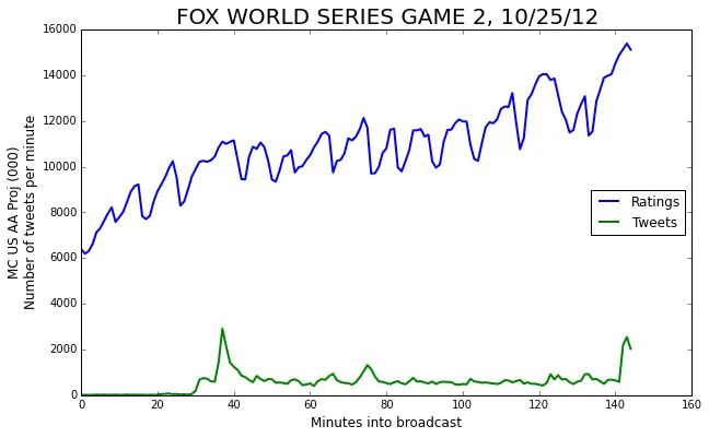
We can compute the event triggered average of this new series as well.
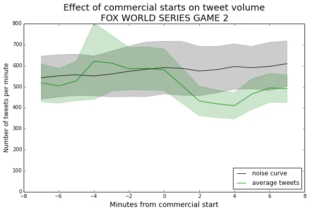
We can see that the tweets curve just barely escapes the noise curve. This says that, for this particular broadcast, commercial breaks don’t have a strong effect on tweet volume.
Editor’s Note: This is something of an anomaly. Most shows have an increase in tweets during the commercial breaks. I have a couple of guesses for why this should be the case. People viewing the World Series may be watching in groups, so they are talking rather than tweeting during the breaks. It could also be that viewers are tweeting in-the-action more often.
Different choices of events
So far, the only events in our event-triggered-averages have been the starts of commercial breaks. However, we can also use attributes of the signals themselves as events. For example, we might be curious about how tweets tend to behave around a peak in the ratings graph. In the curve below, we mark the locations of rating peaks, and then show the event-triggered averages using the peaks as events.
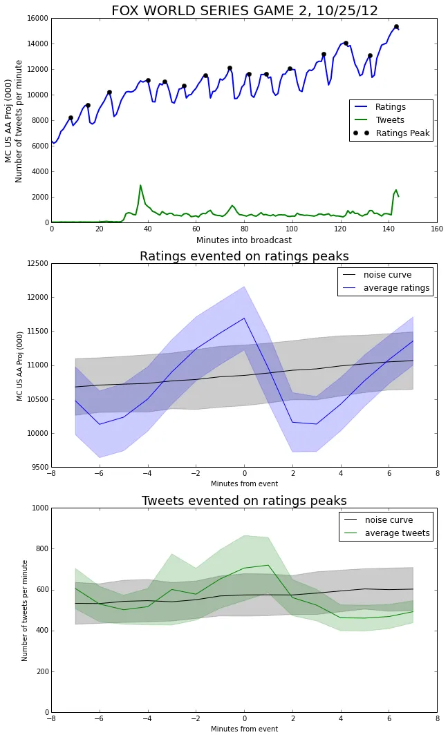
Immediately after the ratings peak, viewership drops abruptly (It doesn’t make it out of the noise band, but the change in value is large enough to comment on). Part of this is likely just a return to normal levels, but I think part is due to the fact that there is often a stoppage of play just after an exciting event. This makes for a good time to go to commercial.
One of the main benefits of event triggered averages is that we can be very selective with our definition of an event. For example, we can choose our events to be tweet peaks—but only the ones that occur during a commercial break.
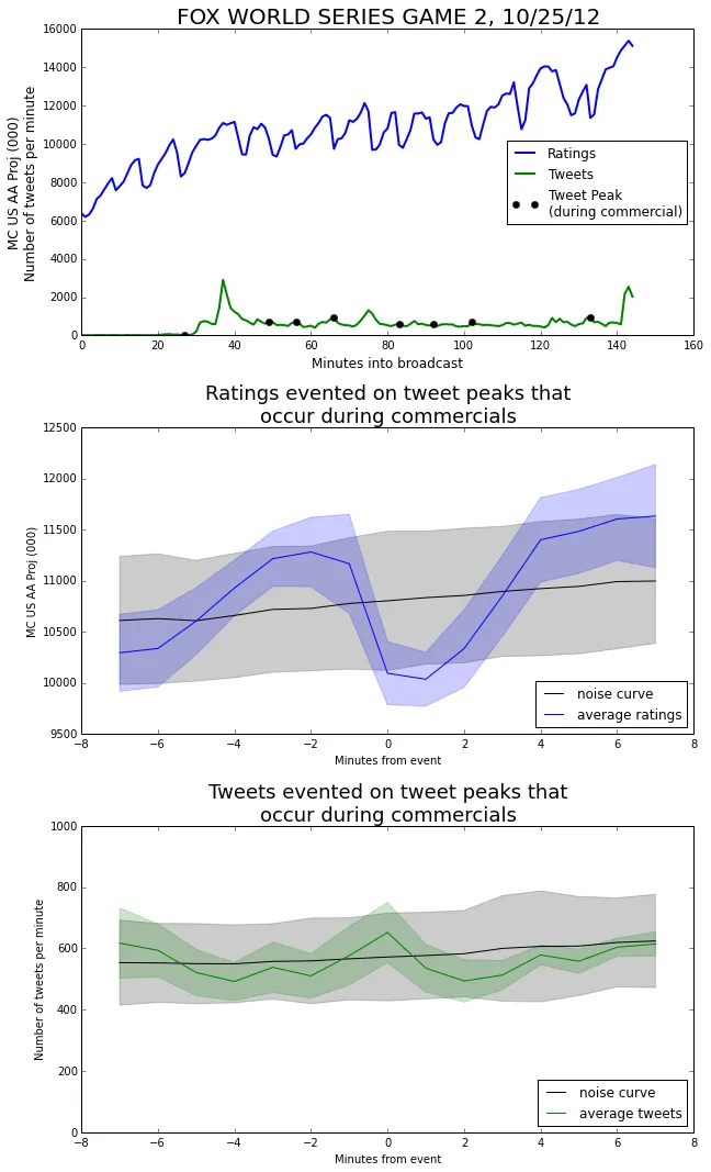
In the ratings curve, we observe a very similar dip as we saw earlier when we evented on commercial starts. This makes sense, because ‘tweets peaks during commercials’ is a pretty good proxy for the commercials themselves.
We can also see that the tweet curve more or less stays within 1 standard deviation of the noise curve the whole time. Even though we evented on tweets, the number of tweets doesn’t vary much from its baseline during commercial breaks.
Looking at the plot of the whole broadcast, we can see that all of these events are small compared with the three much larger peaks at minutes 37, 78, and 143. So, although there was an uptick in tweets during commercials, it was a smaller effect. Most of the tweeting happened in-the-moment, during the show.
We can run the complementary process and use only the tweet peaks the didn’t occur during a commercial.
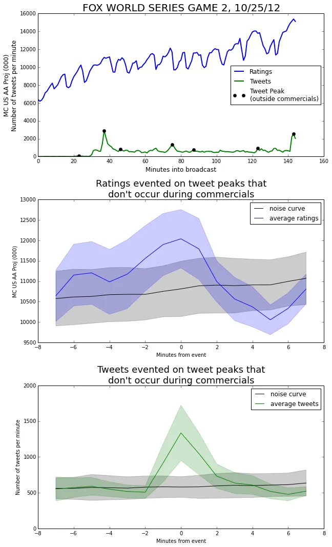
Taking a look at the ratings graph, we can see that the tweet events are associated with an increase in the ratings. This makes sense—when the game is exciting it causes more people to watch and more people to tweet. The distance from the noise curve to the ratings curve is about 1.655 times the standard deviation of the noise curve. This gives a p-value of about 0.0495, just making it into a 95% confidence level.
Multiple shows
We’ve focused on only one show, for simplicity. However, it is valuable to draw events from multiple shows. For example, we could create an event triggered average over all basketball games, where an event is triggered whenever a team scores a basket that puts them in the lead.
By averaging over many episodes, we have a larger pool of events. This decreases our standard error, and makes it easier to find significant results.
Because different shows have vastly different viewerships and tweet volumes, it probably makes sense to normalize within each episode, or at least within each show. That is, subtract the mean and divide by the standard deviation of each episode.